
Build an awesome login form using HTML/CSS

I am a full stack developer from Lahore, Pakistan. I'll be writing articles about latest Web technologies and frameworks.
Happy to see you here.
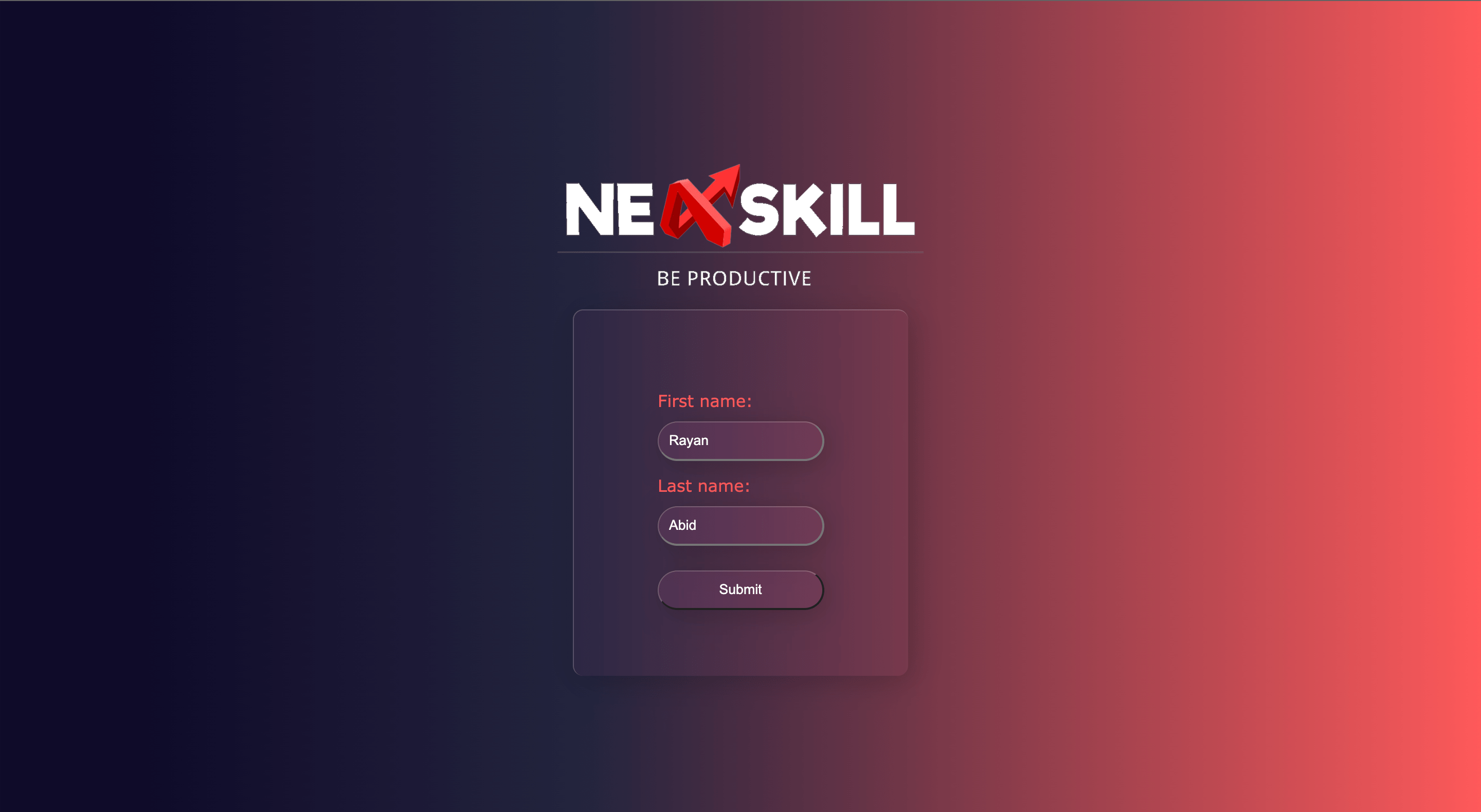
I recently enrolled in a Blockchain development course where they had to teach the basics of HTML, CSS, and Javascript so that everyone is on the same page, So I was assigned to build a form with just HTML and CSS and this is what it looks like.
Now if you're a beginner it might look very tough to set up and build but I can assure you that it's gonna be

Folder Structure
So let's start with the folder structure you can keep it any way you want but this is how I did it.
├── index.html
├── src
│   └── assets
│       └── images
│           ├── logo.png
│           └── logo1.png
└── style.css
Index.html
In the Index.html file we will have our HTML code. Inside the body tag add the following
<div class="container">
    <img class="logo" src="./src/assets/images/logo.png" />
    <div class="card">
      <form>
        <div class="feildContainer">
          <label class="lableText" for="fname">First name:</label><br />
          <input class="inputText" type="text" id="fname" value="Rayan" />
        </div>
        <div class="feildContainer">
          <label class="lableText" for="lname">Last name:</label><br />
          <input class="inputText" type="text" id="lname" value="Abid" />
        </div>

        <input class="inputBtn" type="submit" value="Submit" />
      </form>
    </div>
</div>
and also create a file named style.css and link it in the <head> tag like this
<link rel="stylesheet" href="style.css" />
So by the end your index.html file should look something like this.
<!DOCTYPE html>
<html lang="en">
  <head>
    <meta charset="UTF-8" />
    <meta http-equiv="X-UA-Compatible" content="IE=edge" />
    <meta name="viewport" content="width=device-width, initial-scale=1.0" />
    <link rel="stylesheet" href="style.css" />
    <title>NexSkill#1</title>
  </head>
  <body>
    <div class="container">
      <img class="logo" src="./src/assets/images/logo.png" />
      <div class="card">
        <form>
          <div class="feildContainer">
            <label class="lableText" for="fname">First name:</label><br />
            <input class="inputText" type="text" id="fname" value="Rayan" />
          </div>
          <div class="feildContainer">
            <label class="lableText" for="lname">Last name:</label><br />
            <input class="inputText" type="text" id="lname" value="Abid" />
          </div>

          <input class="inputBtn" type="submit" value="Submit" />
        </form>
      </div>
    </div>
  </body>
</html>
style.css
Now that we have our HTML file setup let's add some styling to it.
First, let's change the background to do that add the following code.
html {
  background: linear-gradient(90deg, #0f0c29 10%, #24243e 40%, #fe595a 100%);
  height: 100vh;
}
This will change the background of the whole page.
Then we will add some CSS to the container
.container {
  display: flex;
  flex-direction: column;
  justify-content: center;
  align-items: center;
  height: 100vh;
}
styling for the logo
.logo {
  width: 25%;
  margin-bottom: 15px;
}
styling the login form card
.card {
  padding: 20px;
  /* width: 20%; */
  /* height: 40%; */
  display: flex;
  flex-direction: column;
  align-items: center;
  justify-content: center;
  background: rgba(236, 110, 173, 0.05);
  backdrop-filter: blur(10px);
  border-top: 1px solid rgba(255, 255, 255, 0.2);
  border-left: 1px solid rgba(255, 255, 255, 0.2);
  box-shadow: 5px 5px 30px rgba(0, 0, 0, 0.2);
  border-radius: 10px;
}
Let's make it responsive as well so
@media only screen and (min-width: 600px) {
  /*Big smartphones [426px -> 600px]*/
  .card {
    padding: 20px;
    width: 20%;
    height: 40%;
    display: flex;
    flex-direction: column;
    align-items: center;
    justify-content: center;
    background: rgba(236, 110, 173, 0.05);
    backdrop-filter: blur(10px);
    border-top: 1px solid rgba(255, 255, 255, 0.2);
    border-left: 1px solid rgba(255, 255, 255, 0.2);
    box-shadow: 5px 5px 30px rgba(0, 0, 0, 0.2);
    border-radius: 10px;
  }
}
So now to style the input fields
.feildContainer {
  margin: 14px 0 14px 0;
}

.FormHead {
  color: #fe595a;
  font-family: Verdana;
}

.lableText {
  color: #fe595a;
  font-family: Verdana;
}

.inputText {
  margin-top: 10px;
  padding: 10px;
  background: rgba(236, 110, 173, 0.05);
  backdrop-filter: blur(10px);
  border-top: 1px solid rgba(255, 255, 255, 0.2);
  border-left: 1px solid rgba(255, 255, 255, 0.2);
  box-shadow: 5px 5px 30px rgba(0, 0, 0, 0.2);
  border-radius: 20px;
  color: white;
}

.inputBtn {
  margin-top: 10px;
  padding: 10px;
  width: 100%;
  background: rgba(236, 110, 173, 0.05);
  backdrop-filter: blur(10px);
  border-top: 1px solid rgba(255, 255, 255, 0.2);
  border-left: 1px solid rgba(255, 255, 255, 0.2);
  box-shadow: 5px 5px 30px rgba(0, 0, 0, 0.2);
  border-radius: 20px;
  color: white;
}
and that's it. So by the end your file should look like this
html {
  background: linear-gradient(90deg, #0f0c29 10%, #24243e 40%, #fe595a 100%);
  height: 100vh;
}

.container {
  display: flex;
  flex-direction: column;
  justify-content: center;
  align-items: center;
  height: 100vh;
}

.logo {
  width: 25%;
  margin-bottom: 15px;
}

.card {
  padding: 20px;
  /* width: 20%; */
  /* height: 40%; */
  display: flex;
  flex-direction: column;
  align-items: center;
  justify-content: center;
  background: rgba(236, 110, 173, 0.05);
  backdrop-filter: blur(10px);
  border-top: 1px solid rgba(255, 255, 255, 0.2);
  border-left: 1px solid rgba(255, 255, 255, 0.2);
  box-shadow: 5px 5px 30px rgba(0, 0, 0, 0.2);
  border-radius: 10px;
}

@media only screen and (min-width: 600px) {
  /*Big smartphones [426px -> 600px]*/
  .card {
    padding: 20px;
    width: 20%;
    height: 40%;
    display: flex;
    flex-direction: column;
    align-items: center;
    justify-content: center;
    background: rgba(236, 110, 173, 0.05);
    backdrop-filter: blur(10px);
    border-top: 1px solid rgba(255, 255, 255, 0.2);
    border-left: 1px solid rgba(255, 255, 255, 0.2);
    box-shadow: 5px 5px 30px rgba(0, 0, 0, 0.2);
    border-radius: 10px;
  }
}

.feildContainer {
  margin: 14px 0 14px 0;
}

.FormHead {
  color: #fe595a;
  font-family: Verdana;
}

.lableText {
  color: #fe595a;
  font-family: Verdana;
}

.inputText {
  margin-top: 10px;
  padding: 10px;
  background: rgba(236, 110, 173, 0.05);
  backdrop-filter: blur(10px);
  border-top: 1px solid rgba(255, 255, 255, 0.2);
  border-left: 1px solid rgba(255, 255, 255, 0.2);
  box-shadow: 5px 5px 30px rgba(0, 0, 0, 0.2);
  border-radius: 20px;
  color: white;
}

.inputBtn {
  margin-top: 10px;
  padding: 10px;
  width: 100%;
  background: rgba(236, 110, 173, 0.05);
  backdrop-filter: blur(10px);
  border-top: 1px solid rgba(255, 255, 255, 0.2);
  border-left: 1px solid rgba(255, 255, 255, 0.2);
  box-shadow: 5px 5px 30px rgba(0, 0, 0, 0.2);
  border-radius: 20px;
  color: white;
}
Updating the logo.
The logo is in the
├── src
│   └── assets
│       └── images
Directory so to change that just replace the image with your logo and change the name to logo.png.
and that's it now you have a simple login form created using HTML/CSS.
You can find the code on GitHub
Drop a star ⭐ on the repo and maybe follow me on Github and on Hashnode
Thank you for reading!